A brand that’s true blue
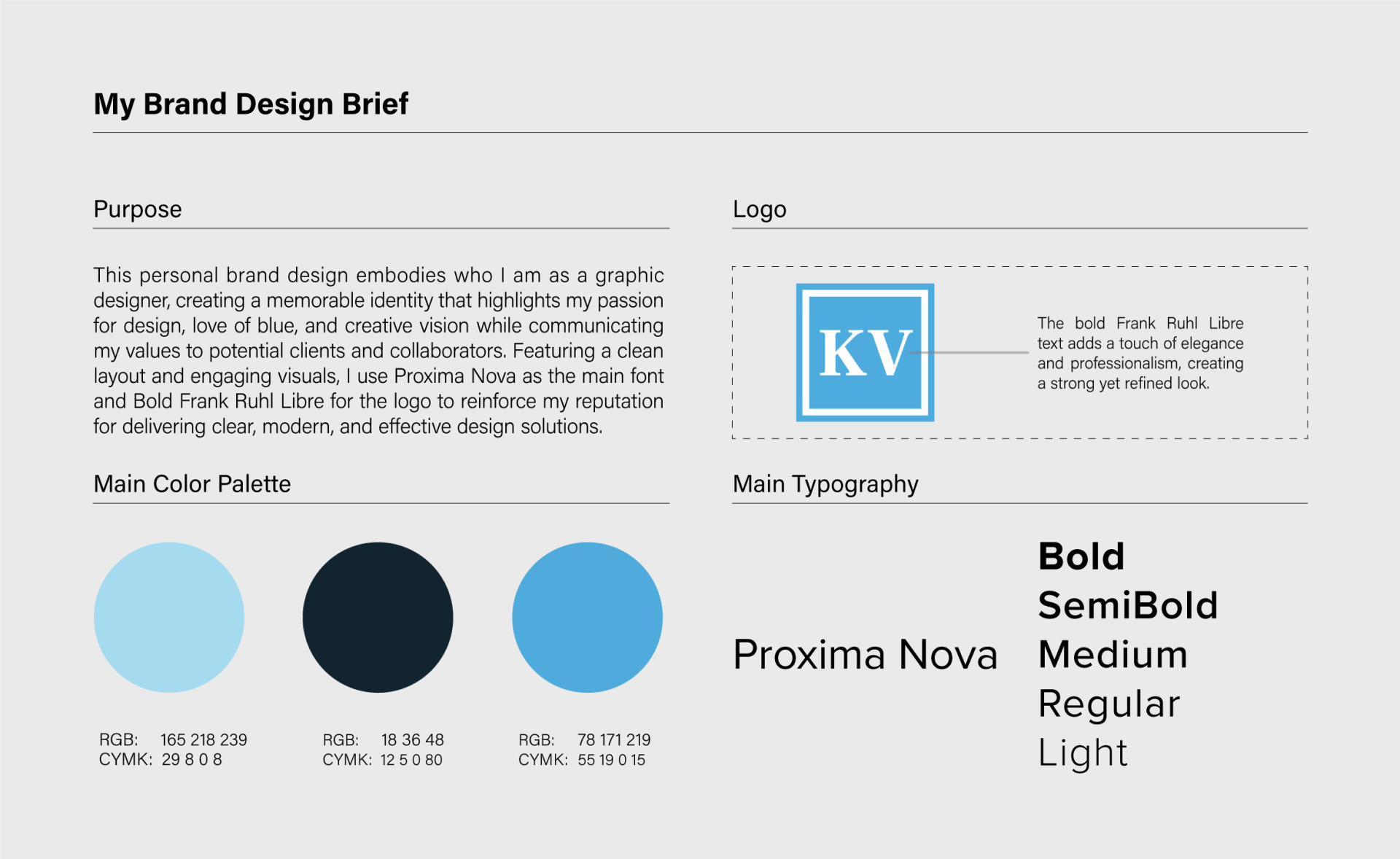
This is where my personal brand first began. I built it to show who I am as a designer: my love of blue, clean layouts and a clear, modern style, with Proxima Nova for everyday type and bold Frank Ruhl Libre for the KV logo. The blues are still at the heart of everything I make, even as the rest keeps growing with me.
- FOR
- My personal brand
- MY ROLE
- Solo designer, concept to final
- WHAT I MADE
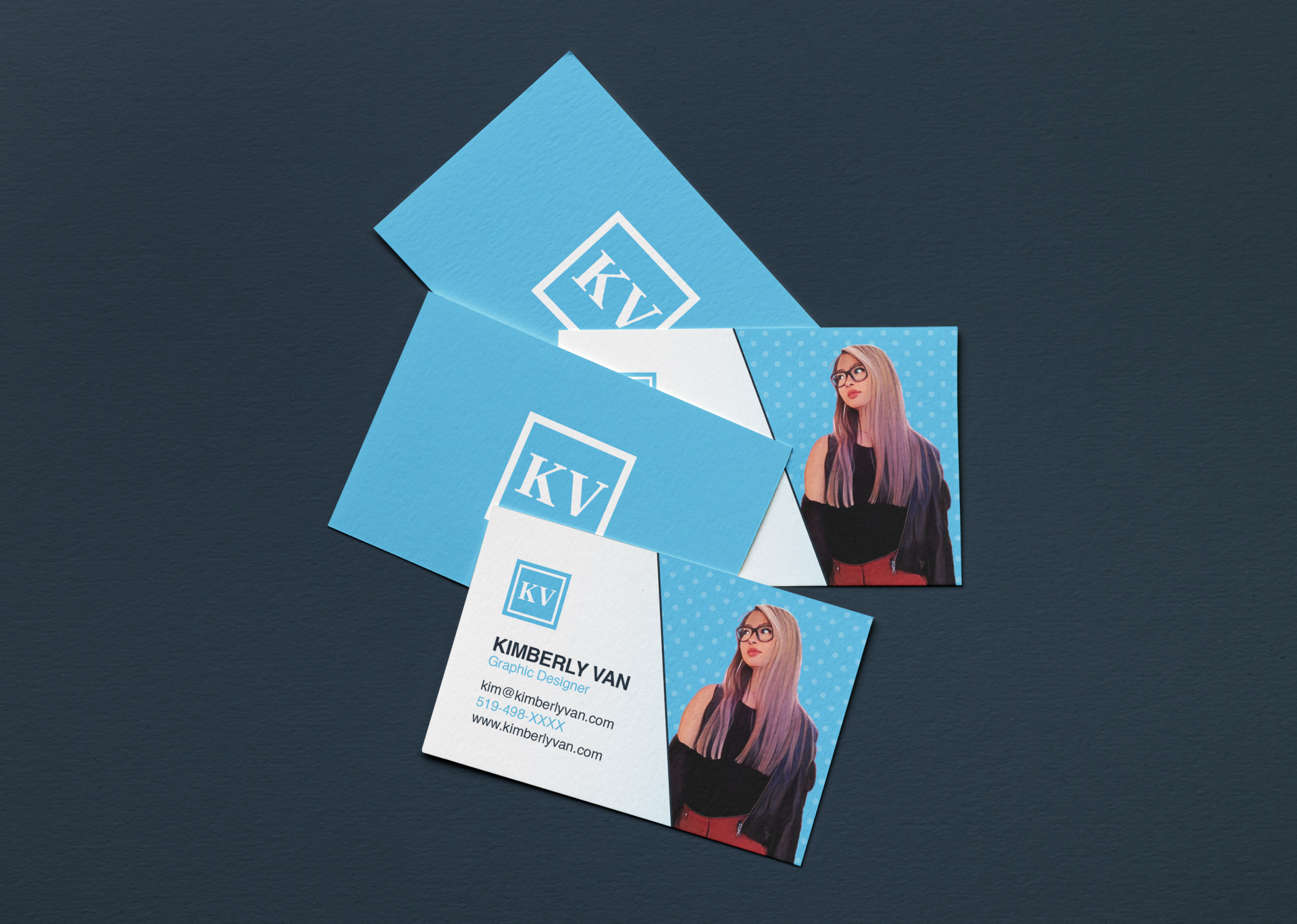
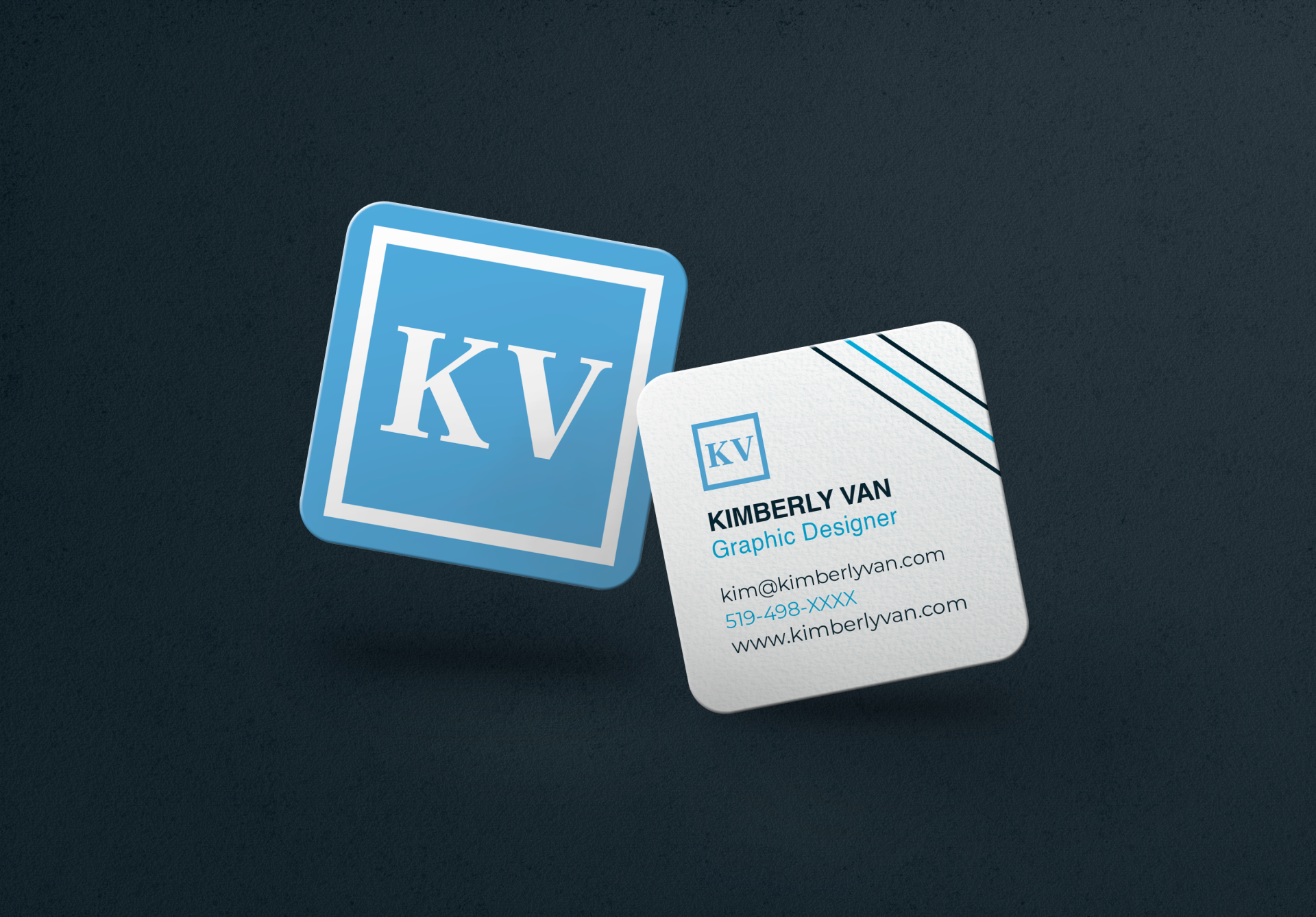
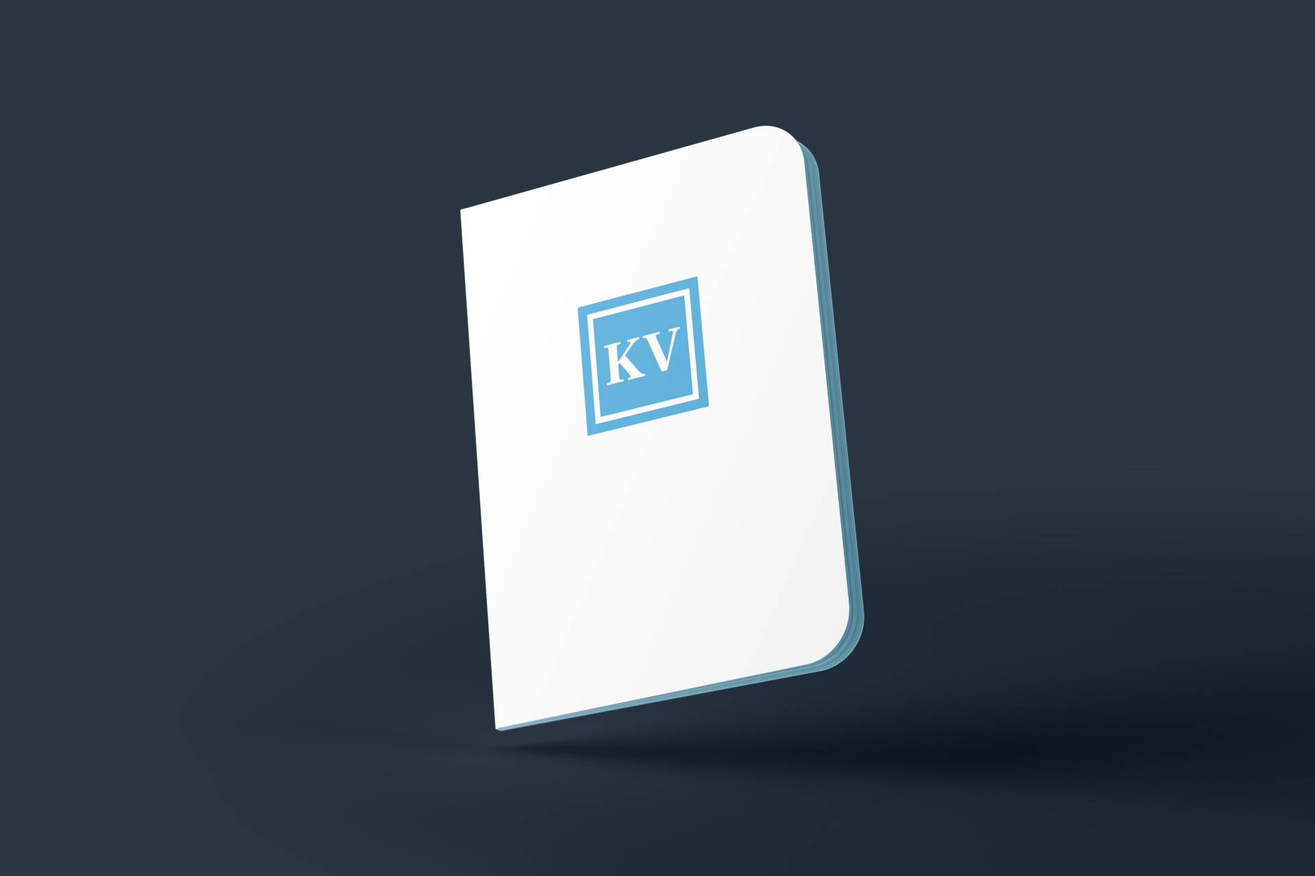
- Logo, business cards, notebook, design brief
- ORIGINAL TYPE
- Proxima Nova, Frank Ruhl Libre
The brief
When I first set out to build my brand, I wanted a memorable identity that showed off my passion for design, my love of blue and my creative vision, while telling clients and collaborators exactly what I value: design that’s clear, modern and effective.
What I did
I started with a simple palette of three blues, from a soft light blue to a deep navy, and set the KV monogram in bold Frank Ruhl Libre for a touch of elegance. Proxima Nova handled everything else, keeping every layout clean and easy to read, from business cards to notebooks.
Where it’s going
This is where my brand began, and it’s still growing. The three blues are the thread that ties everything together, and they carry right through to this portfolio, along with my KV logo. The type and style have evolved into something bolder and more playful, the way a brand should as the designer behind it grows.
What I learned: a brand isn’t something you design once and file away. Knowing which parts to keep and which to let evolve is what keeps it feeling true to me, and designing for myself taught me to make those tough calls and trust my own eye.